I’ve been MIA finishing up my last semester at Emerson. Along the way, I’ve dealt with several small set-backs to maintaining this blog. Among them were the untimely death of my blue Raliegh, the unfortunate goop-build-up on the lens of my Cybershot, and a course-load/workload that inhibited me from addressing either of the former two set-backs. I’ve remained an observer of all new developments in Boston, and an active member of the community. I’m still at work or school downtown everyday, or am riding the messed-up rails two and from Allston when not.
In the past months, my observations have warranted dozens of unpublished posts. Without a camera or a picture to accompany any of them, I know none of the posts are anything I’d want to look over, and least of all you, the people who see that I do this blog-thing from their news feeds.
So while I still am bike free, I have gone about cleaning my camera and think it is almost operational. While I’ll have more posts to come that you don’t have to actually read to enjoy, here is an update of the last post I made with pictures someone else took!


Here is an update of the expanded Isabella Stewart Gardner Museum from my previous post last Summer. The photographs come from ArchBoston.org and were taken by member kz1000ps. The expansion doubles the size of the current Gardner museum while not impacting the original Venetian-style palace per request of Mrs. Gardner herself.
Though the addition is barely attached to the original museum in following with Mrs. Gardner’s request, it does a lot to change the aesthetic of the classic palace it abuts.
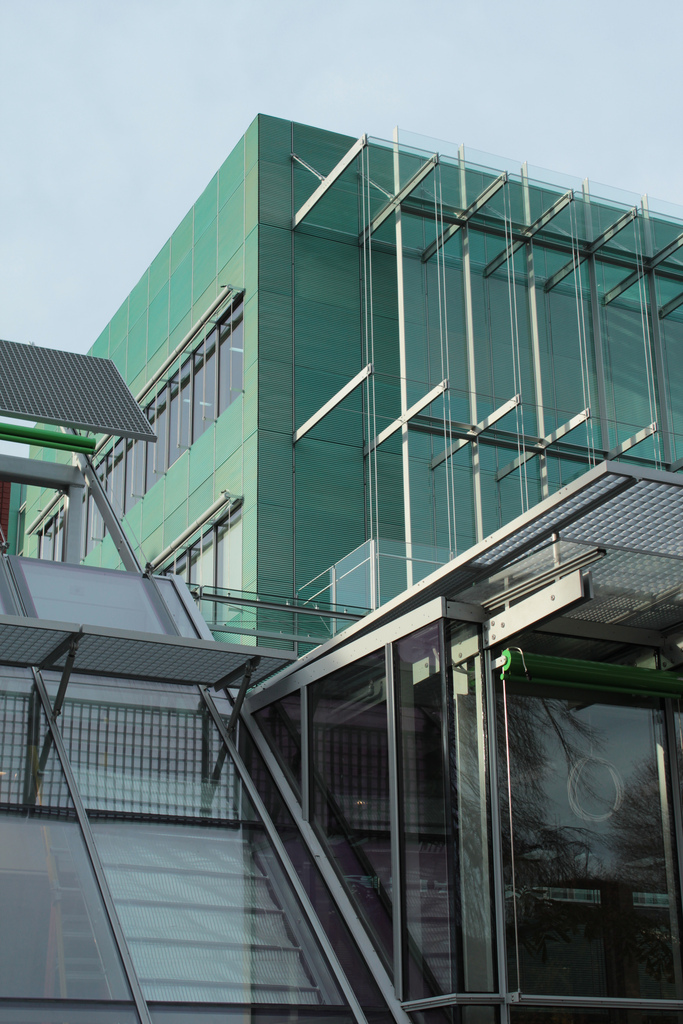
As has been the trend, slick and modern is in vogue for museum additions (see the MFA’s Art of The America’s wing). Where the new wing of the MFA succeeds this addition fails. Instead of clean lines and sections and purposeful geometric accents, this thing has geometry for seemingly no good reason.

It is a big green box. It doesn’t juxtapose the old palace but instead takes away any subtle grandeur or air given off by the simple and tasteful original museum- house. To make it not just look like a big green box, they made some sort of fire-escape with an unnecessary series of tension wires. A modern piece of architecture doesn’t ornament – this has an excessive amount of ornament disguised as functional. That would make it post-modern if it had any sense of humor or alluded to any previous styles, but instead fails to mock or even seem inspired by modernism and just seems like a lazy attempt by an amateur. Which is sad, because the Gardner paid a lot to have Renzo Piano, a premier architect, especially in museum architecture, help build them a landmark.
Having not been inside, I can’t say if Piano’s skills have succeeded in making an effective space for viewing the arts. The MFA’s new wing is almost dull from the outside but designed wonderfully as an interior which appreciates the art it holds within and on its’ walls. But this building is lazily trying on a few things, making nods to modernism, not understanding it’s place in any design bracket, confusing the outside of both wings of the Gardner compound.
I’ll reserve final judgement until I get there personally and take some shots of my own.


Leave a comment